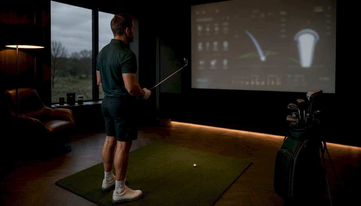
Progress visualization shows exactly how far you've come toward a specific target, translated into a visual format your brain can read in under a second. Common formats include linear progress bars, gauge charts, donut charts, and milestone trackers, each converting raw numbers into an immediate status signal: ahead, on pace, or behind.
For golfers, that signal matters more than most people realize. Tracking fairways hit or greens in regulation as a percentage bar tells you something a scorecard never will: whether your practice is actually moving the needle.
Key visual formats at a glance:
- Linear progress bars: fill proportionally from 0–100%, ideal for session-based metrics
- Gauge charts: show a single value against a target range, great for accuracy percentages
- Donut charts: display part-to-whole relationships across multiple metrics
- Milestone trackers: mark discrete achievements along a defined path
How progress visualization boosts motivation and cuts mental clutter
The motivational lift from visual tracking isn't accidental. Research on goal pursuit shows that as you approach a goal, easy-to-visualize representations increase effort and commitment through the goal-gradient effect. The closer the finish line looks, the harder you push.

There's a second benefit that gets less attention: cognitive load reduction. Breaking a large objective like "improve my short game" into smaller visual chunks, say, five sessions of chipping practice logged on a progress bar, removes the mental weight of tracking everything in your head. You see the state; you don't have to calculate it.
Studies on motivation also show that trackers which clearly communicate achievements and guide toward meaningful next steps outperform passive percentage displays. A bar that says "3 of 5 sessions done, next: bunker work" beats one that just reads "60%."
Psychological advantages of visual progress tracking:
- Triggers dopamine on milestone completion, reinforcing continued effort
- Reduces anxiety by making tasks feel structured rather than open-ended
- Increases transparency so you can spot stalls before they become habits
- Sustains commitment through the endowed progress effect, where visible past effort raises the psychological cost of quitting
Best practices for setting up a tracker that actually works
The most common mistake golfers make with progress trackers is building them once and forgetting them. Expert guidance recommends updating trackers at least weekly to keep the feedback loop alive.
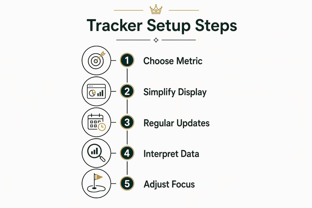
A few other principles hold up across contexts. Choose a clear anchor: a specific date, a tournament, or a session count. Pick a unit of progress that matches what you're measuring, whether that's percentage complete, sessions logged, or a streak count. Then put the tracker somewhere you'll see it without trying, a phone lock screen, a dashboard widget, or a printed chart on your simulator wall.
Steps for effective implementation:
- Define one anchor date or target (e.g., club championship in 8 weeks)
- Select a single unit of progress per tracker (sessions, %, or streak)
- Place the visual where it appears without opening an app
- Update after every session, not just when you remember
- Review weekly to catch drift before it compounds
Pro Tip: Pick one primary metric per tracker. Dashboard clutter kills motivation faster than slow progress does. Secondary data can live elsewhere; your main visual should answer one question instantly.
Applying progress visualization to your golf game
Raw scores lie. A 78 one week and an 84 the next tells you almost nothing about whether your ball-striking improved. Golf-specific tracking works best when you focus on sub-goals like fairways hit, greens in regulation, or putts per round across defined session blocks, not just the final number on the card.
This approach creates the dopamine-triggering milestones the goal-gradient effect depends on. When you can see that your greens in regulation rate improved noticeably over multiple sessions, that's a concrete signal worth acting on. It also tells you where to point your next practice block.
Interpreting the data matters as much as collecting it. A plateau in one metric while another climbs often means you've shifted effort, not stalled. Tracking session trends over time reveals those patterns far better than any single-session review.
Sim2coursecaddie imports shot data from any golf simulator, renders it in a 3D driving range view, and layers AI-driven club recommendations on top of real-time course conditions. That combination turns raw simulator output into the kind of visual feedback loop described throughout this article, without a subscription or extra hardware.
Golf-specific progress tracking best practices:
- Track fairways hit, greens in regulation, and putts per round as separate bars
- Set session blocks covering several rounds before evaluating trend direction.
- Use a golf performance dashboard to keep all metrics in one persistent view
- Avoid tracking more than three metrics simultaneously to prevent overload
- Pair visual data with fitness goal setting to connect on-course metrics with physical conditioning
Pro Tip: When a metric flatlines over multiple sessions, don't add more data. Narrow your focus to the one drill most likely to move that number, then track only that for two weeks.
Sim2coursecaddie puts your golf data where you can actually use it
Serious golfers who want their simulator data to mean something beyond a session summary will find Sim2coursecaddie worth a look. It imports shot data from any simulator, visualizes swings in 3D, and delivers AI-driven club recommendations tied to actual course conditions, all at no cost.

No subscription. No proprietary hardware. Just the analytics and visualization your practice sessions have been generating all along, finally presented in a format that tells you what to do next.
Key Takeaways
Progress visualization converts abstract goal data into immediate visual signals that show whether you're ahead, on pace, or behind your target.
| Point | Details |
|---|---|
| Visual formats matter | Bars, gauges, donut charts, and milestone trackers each suit different metric types. |
| Goal-gradient effect | Effort and commitment increase as a visual goal appears closer to completion. |
| Update frequency | Updating trackers at least weekly keeps the feedback loop and motivation intact. |
| One metric per view | Dashboard clutter reduces motivation; one anchor metric keeps focus clear. |
| Sim2coursecaddie | Imports simulator shot data and visualizes it in 3D with AI club recommendations, free. |