
Data visualization in golf is defined as the practice of converting raw shot metrics, swing data, and environmental factors into charts, maps, and interactive dashboards that golfers can read and act on. The PGA Tour's ShotLink system and IBM's AI tools at the Masters Tournament have proven this approach works at the highest level. Birdie probability maps, dispersion charts, and carry ladders now give golfers at every level the same analytical edge that tour professionals have used for years. Understanding the role of data visualization in golf is no longer optional for serious players. It is the clearest path from guesswork to genuine improvement.
What kinds of golf data are visualized, and how do they improve player awareness?
Golf generates more measurable data per shot than most sports. Every swing produces metrics worth capturing and studying.
The most common data points tracked include:
- Shot distance and carry — total distance versus actual carry, split by club
- Club path and face angle — the two biggest drivers of ball flight direction
- Launch angle and spin rate — determines trajectory and landing behavior
- Shot dispersion — how far left or right shots scatter from the intended line
- Gapping — the distance difference between consecutive clubs in your bag
- Environmental context — temperature, altitude, and air pressure, which shift carry distances measurably
Raw numbers from a launch monitor tell you what happened. Dispersion maps and gapping charts show you why it happened and where the pattern breaks down. A dispersion map, for example, plots every shot from a session on a single overhead view. You see immediately whether your misses cluster left, right, or short. That visual takes three seconds to read. The same information buried in a spreadsheet takes three minutes and still does not land with the same clarity.
Consistency heatmaps add another layer. They color-code shot quality across a session, so you can spot fatigue drift or a mechanical change that crept in after the first 20 balls. Multi-session tracking extends this further, flagging where your dispersion widens or your gapping collapses across weeks of practice.
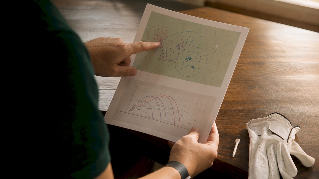
Pro Tip: Review your dispersion map at the end of every simulator session before you change anything in your swing. If your misses are consistent, the problem is likely setup or aim, not mechanics. Visualization tells you which fix to chase.
How does AI take golf data visualization beyond traditional charts?
Traditional charts show what already happened. AI-driven visualization shows what is likely to happen next. That shift changes how golfers and coaches use data entirely.
IBM's AI tools at the 2026 Masters Tournament introduced "Hole Insights," which calculate birdie and par probabilities based on a player's exact position on the course. A golfer standing 160 yards from the pin on the 12th hole at Augusta sees a 12.5% birdie probability and an 81.25% par probability from that spot. That number is not a guess. It is built from years of historical shot data layered over current conditions. Knowing those odds changes the shot selection immediately.
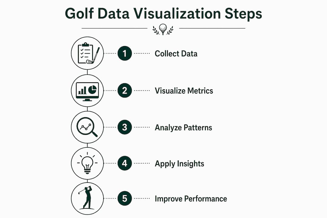
AWS and the PGA Tour have pushed further with agentic AI platforms that build a digital twin for each player. The twin mirrors the player's historical shot patterns and updates in real time during a round. Coaches can compare a player's live performance against their seasonal baseline and spot drift before it costs strokes.
| AI visualization feature | What it shows | Practical use |
|---|---|---|
| Hole Insights probability maps | Birdie/par odds by position | Informs aggressive vs. conservative shot selection |
| Digital twin comparison | Live stats vs. seasonal baseline | Detects performance drift during a round |
| Automated storylines | Dynamic narrative of key moments | Helps coaches review rounds faster |
| 3D flight path tracing | Ball trajectory and landing zone | Identifies launch or spin issues visually |
Visualization also transforms how fans experience the game. Automatic storylines and dynamic visual updates turn a scorecard into a narrative. For players, the same technology turns a practice session into a coaching conversation with data.
Pro Tip: If your visualization platform offers a digital twin or baseline comparison feature, set your baseline at the start of each season. Comparing current sessions against that anchor reveals drift that feels invisible during play.
What are the top golf data visualization tools players use in 2026?
The best visualization tools for golfers fall into two broad categories: proprietary apps tied to specific hardware, and open platforms that accept raw data exports from any source.
Proprietary apps from launch monitor brands deliver solid session summaries. They show carry distance, ball speed, and basic dispersion. The limitation is that standard golf apps often lock data in proprietary silos, preventing golfers from building richer trend analyses across sessions or clubs. You get a snapshot, not a story.
Open platforms and self-hosted dashboards solve that problem. Golfers who export raw data from their launch monitors can build session trend charts, multi-club dispersion comparisons, gapping ladders, and environment-adjusted carry tables. The Garmin Golf app, for instance, allows data exports that feed into custom dashboards. Interactive 3D tools like flight path tracers and top-down shot plotters add a visual dimension that flat charts cannot match.
Key features to look for in any visualization platform:
- Multi-club tracking — compares performance across every club in the bag, not just the driver
- Dispersion mapping — plots shot scatter visually so patterns are obvious
- Gapping analysis — confirms consistent distance gaps between clubs
- Environment context — adjusts carry estimates for temperature and altitude
- Raw data export — lets you move data into any analysis tool you choose
Sim2coursecaddie sits in a category of its own. It imports shot data from any golf simulator, visualizes swings in a 3D driving range environment, and delivers AI-driven club recommendations based on real course conditions. The platform offers these features at no cost, which removes the barrier that keeps most amateur golfers from accessing professional-grade analytics.
Pro Tip: Always choose a platform that lets you export your raw data. Proprietary formats trap your history inside one app. Raw exports mean your data travels with you, regardless of which tools you use next season.
How can golfers apply visualization insights to improve decisions and scores?
Seeing the data is step one. Acting on it is where improvement actually happens.
-
Identify your weakest club first. Pull up your multi-club dispersion maps and find the club with the widest scatter. That club costs you the most strokes per round. Tracking multiple clubs reveals these gaps faster than feel-based practice ever will.
-
Build your practice plan around the visual evidence. If your 7-iron dispersion map shows a consistent left miss, spend 30 minutes on face angle drills before touching any other club. Visualization tells you where to invest your practice time.
-
Factor in environment data before every round. A 10-degree temperature drop reduces carry by roughly one club length for most golfers. Platforms that calculate environment-adjusted distances remove the guesswork from club selection on cold mornings or at elevation.
-
Use probability data to choose between aggressive and safe shots. Caddies and data architects describe visualization as a 'crystal ball' that layers historic shot data over current conditions. If your dispersion map shows a 40-yard scatter with a 5-iron, a layup with a 9-iron is the higher-percentage play, even when the aggressive line looks tempting.
-
Share your dashboards with your coach. A coach reviewing your dispersion maps and session trend charts before a lesson arrives prepared. The session focuses on the actual problem, not a symptom the coach noticed during warmup. Tracking session trends and sharing that data cuts the time it takes to diagnose and fix recurring issues.
The golfers who improve fastest are not the ones who practice the most. They are the ones who practice the right things, and visualization tells them exactly what those things are.
Key Takeaways
Data visualization in golf converts raw shot metrics into visual patterns that reveal weaknesses, guide practice, and inform shot selection with a clarity that numbers alone cannot deliver.
| Point | Details |
|---|---|
| Visualization beats raw numbers | Dispersion maps and heatmaps reveal patterns in seconds that spreadsheets cannot communicate clearly. |
| AI adds predictive power | Tools like IBM's Hole Insights calculate birdie and par probabilities by position, changing shot selection in real time. |
| Raw data export matters | Platforms that lock data in proprietary formats limit long-term trend analysis and cross-tool flexibility. |
| Practice smarter, not more | Multi-club tracking identifies the weakest club in your bag so practice time targets the highest-impact area. |
| Environment context changes decisions | Temperature and altitude adjustments built into visualization tools remove guesswork from club selection. |
Why I think most golfers are still leaving data on the table
I have watched golfers spend thousands of dollars on lessons and equipment while ignoring the one thing that would actually accelerate their improvement: a clear visual record of what their shots are doing. The shift from intuition-based coaching to data-driven coaching is not new at the tour level. What surprises me is how slowly it has reached the amateur game.
The most common misconception I hear is that data visualization is for professionals or tech-savvy players. That is wrong. The tools available in 2026 are more accessible than they have ever been. A golfer with a simulator session and a free platform like Sim2coursecaddie can generate the same quality of dispersion analysis that a tour player's coaching team reviews after a range session.
The second misconception is that more data means more confusion. The opposite is true when the data is visualized well. The 5 C's of data visualization, which are Clarity, Context, Color, Consistency, and Chart Selection, exist precisely to make complex information readable at a glance. A well-built dispersion map does not overwhelm you. It answers one question immediately: where are my misses going?
My honest advice is to start with one metric, your dispersion on the club you use most often, and track it for four sessions. You will see a pattern. That pattern will tell you more about your game than any tip you have read or lesson you have taken without data to back it up.
— Jeff
How Sim2coursecaddie supports your data visualization practice
Sim2coursecaddie gives golfers direct access to the raw data that makes advanced visualization possible. The platform imports shot data from any golf simulator, so you are not locked into a single hardware ecosystem.
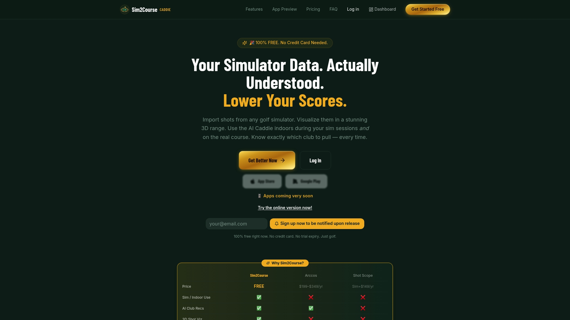
Golfers who want to build custom dashboards, run multi-session trend analyses, or share detailed dispersion reports with a coach can access raw data exports through Sim2coursecaddie at no cost. The AI-driven club recommendations also factor in real course conditions, so the insights you build in the simulator translate directly to on-course decisions. For amateur players and coaches who want professional-grade analytics without a professional-grade budget, Sim2coursecaddie is the practical starting point.
FAQ
What is the role of data visualization in golf?
Data visualization in golf converts raw shot metrics like dispersion, carry distance, and launch angle into charts and maps that golfers can read and act on. It replaces guesswork with clear visual evidence of strengths and weaknesses.
How does AI improve golf data visualization?
AI tools like IBM's Hole Insights calculate scoring probabilities by position, while agentic AI platforms build digital twins that compare live performance against a player's seasonal baseline in real time.
What are the best shot data visualization tools for golfers?
The best tools combine multi-club tracking, dispersion mapping, gapping analysis, and raw data export. Sim2coursecaddie offers all of these features for free, making it accessible for both amateur players and coaches.
How do I use visualization data to improve my practice?
Identify the club with the widest dispersion in your maps and build your next practice session around fixing that specific pattern. AI-driven improvement tools can also flag which metrics to prioritize based on your session history.
What are the 5 C's of data visualization in golf?
The 5 C's are Clarity, Context, Color, Consistency, and Chart Selection. Applying these principles ensures your golf visuals communicate performance patterns clearly rather than adding noise to an already complex dataset.