
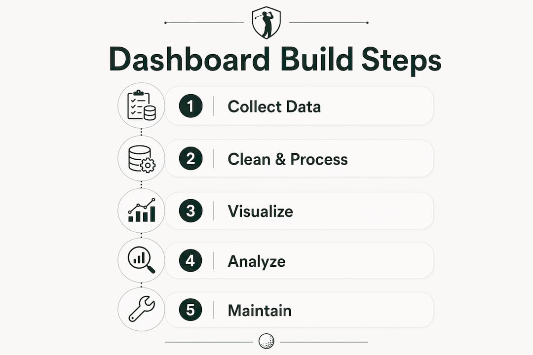
A golf performance dashboard is a visual interface that converts raw simulator shot logs into trackable metrics like carry distance, shot dispersion, and club efficiency. Golfers who build performance dashboard home sim data setups gain a clear picture of their game that a scorecard alone never provides. The process follows three stages: data collection, processing with tools like pandas or SQL, and visualization built around golf-specific KPIs. Sim2coursecaddie makes that first stage straightforward by letting you import shot data from any simulator and export it in structured formats ready for analysis.
What tools and data sources do you need to build a home golf sim performance dashboard?
Every home sim performance dashboard starts with clean, structured data. Most simulators export shot logs that include club selection, ball speed, launch angle, carry distance, and lateral dispersion. These raw exports are the foundation of any meaningful sim data analysis.
The tools you need fall into three categories.

Data collection: Your simulator's native export function or Sim2coursecaddie's raw data export gives you structured shot logs in CSV or JSON format. Sim2coursecaddie supports import from any simulator, which removes the compatibility headache most golfers hit first.
Data processing: Python with pandas is the most widely used option for cleaning and aggregating golf shot data. SQL works equally well if you prefer a database-first approach. Both handle the filtering, grouping, and statistical summaries that turn a raw shot list into a performance tracking dashboard.
Visualization: Modular dashboard frameworks give you the most flexibility. Home Assistant is a popular choice among enthusiasts because it supports custom UI cards and real-time data storage. Each card can display a single metric, such as driver dispersion or wedge carry average, and you can rearrange them as your training focus shifts.
Pro Tip: Export your shot data after every session, not weekly. Small, consistent exports are far easier to clean and process than one large dump with inconsistent formatting.
The table below shows how the three tool categories compare by function.
| Category | Tool options | Primary function |
|---|---|---|
| Data collection | Sim2coursecaddie, native sim export | Shot log export in CSV or JSON |
| Data processing | Python/pandas, SQL | Cleaning, filtering, aggregation |
| Visualization | Home Assistant, custom web dashboards | Interactive charts and metric cards |
How do you process and structure golf simulation data for dashboard use?
Raw shot logs are noisy. A single session might include warm-up swings, mis-hits you already know about, and test shots that skew your averages. Processing that data correctly is what separates a useful home performance dashboard from a cluttered spreadsheet.
Follow these steps to structure your data properly.
-
Export and load your data. Pull your CSV or JSON file from Sim2coursecaddie or your simulator. Load it into pandas with a single read function. Check column names and data types before touching anything else.
-
Filter out bad data. Remove shots with zero carry distance, duplicate entries, and any flagged practice swings. A simple threshold filter, such as dropping any carry below 30 yards for a driver, removes obvious outliers without distorting your real distribution.
-
Group shots by club and shot type. Binning shots by club or distance group reduces noise and surfaces trends that a raw list hides. A grouped pandas DataFrame lets you calculate per-club stats in one pass.
-
Calculate your KPIs. The most useful statistical summaries for golf are mean carry, median carry, standard deviation of lateral dispersion, and 90th percentile distance. Standard deviation tells you how consistent you are. The 90th percentile shows your ceiling without letting outlier bombs inflate the number.
-
Store aggregated results separately. Write your summary stats to a separate table or CSV. Never run live queries against your full raw shot log during dashboard use. That separation keeps your dashboard fast and prevents aggregation errors from creeping into your charts.
-
Schedule regular updates. Set a script to reprocess your data after each session. A nightly automation that computes rolling 30-day averages keeps your dashboard current without manual effort.
Pro Tip: Always keep your raw shot log untouched. Work only on a copy during processing. If your cleaning logic has a bug, you can rerun it against the original without losing any data.
Multi-session shot tracking becomes far more powerful once your data is structured this way. Trends that are invisible in a single session become obvious across 10 or 20 sessions of clean, grouped data.
What are best practices for designing a golf performance dashboard?
Dashboard design is where most golfers go wrong. The instinct is to display everything. Visualizing all available data overwhelms you and produces analysis paralysis instead of clear training direction. The fix is to start with a specific question.
Good starting questions include: "Is my driver dispersion improving?" or "Which club has the most inconsistent carry?" Each question maps to one or two charts, not a wall of numbers.
Choose the right chart type for each metric:
- Line charts work best for tracking trends over time, such as your 7-day rolling carry average per club.
- Scatterplots show shot dispersion clearly. Plot lateral offset on the X axis and carry on the Y axis to see your shot pattern at a glance.
- Bar charts compare clubs side by side for a single metric like mean carry or standard deviation.
- Gauge or number cards display a single KPI prominently, such as your current 30-day driver average.
Build with modular cards. A modular card layout lets you add, remove, or reorder metrics without rebuilding the whole dashboard. Dedicate one card to driver accuracy, one to wedge distance control, and one to recent session trends. That structure mirrors how a caddie thinks: one club, one problem, one plan.
Always compare against a baseline. Comparing current data against historical averages or target goals is what makes a dashboard actionable. A carry distance number means nothing without context. The same number compared to your 30-day average tells you whether you are improving, regressing, or holding steady.
Pro Tip: Build your first dashboard with no more than five metrics. Add a sixth only when you have acted on the first five. Constraint forces clarity.
Sim2coursecaddie's AI-driven club recommendations connect directly to this design philosophy. The app already surfaces improvement opportunities based on your shot data, which gives you a ready-made set of questions to anchor your dashboard around.
How do you maintain your dashboard for long-term improvement?
A dashboard you built for your driver in january becomes less useful by april when your short game needs work. Long-term value comes from treating your dashboard as a living tool, not a finished project.
Keep data storage persistent and organized. Store every session's processed data in a single database or folder structure organized by date. This lets you query any time window without hunting through files. Pre-aggregating data on a schedule, such as nightly scripts that compute weekly and monthly averages, keeps the dashboard fast even as your data grows.
Rotate metrics as your focus shifts. If you spend six weeks working on driver consistency and hit your target standard deviation, retire that card and replace it with a wedge accuracy card. Tracking multiple clubs over time reveals which parts of your bag are holding your scores back.
Watch for these common maintenance pitfalls:
- Letting raw data accumulate without processing creates a backlog that is painful to clean all at once.
- Forgetting to update your baseline when your skill level genuinely improves makes your comparisons misleading.
- Adding too many metrics after early success brings back the analysis paralysis you designed against.
- Skipping sessions without logging them creates gaps that distort rolling averages.
Pro Tip: Automate your data pipeline with a simple scheduled script. Even a basic Python cron job that runs after each session keeps your dashboard accurate without any manual steps.
Session-level data is most useful when it feeds into a multi-week view. A single bad session looks alarming in isolation. Across 20 sessions, it reads as normal variance. That perspective is what separates data-driven training from reactive frustration.
Key Takeaways
A golf performance dashboard built from home sim data works only when data collection, processing, and visualization each serve a specific training question.
| Point | Details |
|---|---|
| Start with clean, structured data | Export shot logs after every session and filter outliers before any analysis. |
| Use statistical grouping | Bin shots by club and calculate mean, standard deviation, and 90th percentile for each group. |
| Design around specific questions | Limit your dashboard to five metrics tied to clear training goals to avoid analysis paralysis. |
| Compare against baselines | Current session data only becomes useful when measured against 30-day averages or target goals. |
| Automate and maintain | Schedule nightly aggregation scripts and rotate metrics as your training focus evolves. |
Why I stopped building dashboards that show everything
The first golf dashboard I built had 14 charts. I was proud of it for about a week. Then I stopped opening it because every session produced a wall of numbers that pointed in six different directions at once.
The shift that actually helped was asking one question per training block. For four weeks, the only thing on my dashboard was driver lateral dispersion. One scatterplot, one 30-day trend line, one target line. That constraint forced me to practice with intent instead of just hitting balls and hoping the data would tell me something.
The technical side matters less than most golfers think. You do not need a complex pipeline to get value from your sim data. A clean CSV, a few pandas groupby calls, and a simple chart library will outperform an elaborate setup you never use. Start with the simplest version that answers your current question, then add complexity only when the simple version stops being enough.
Data is a training partner, not a report card. The goal is not a perfect dashboard. The goal is a better golf game.
— Jeff
Sim2coursecaddie turns raw sim data into dashboard-ready exports
Golfers who want to build a performance tracking dashboard without wrestling with data compatibility issues have a direct path through Sim2coursecaddie.
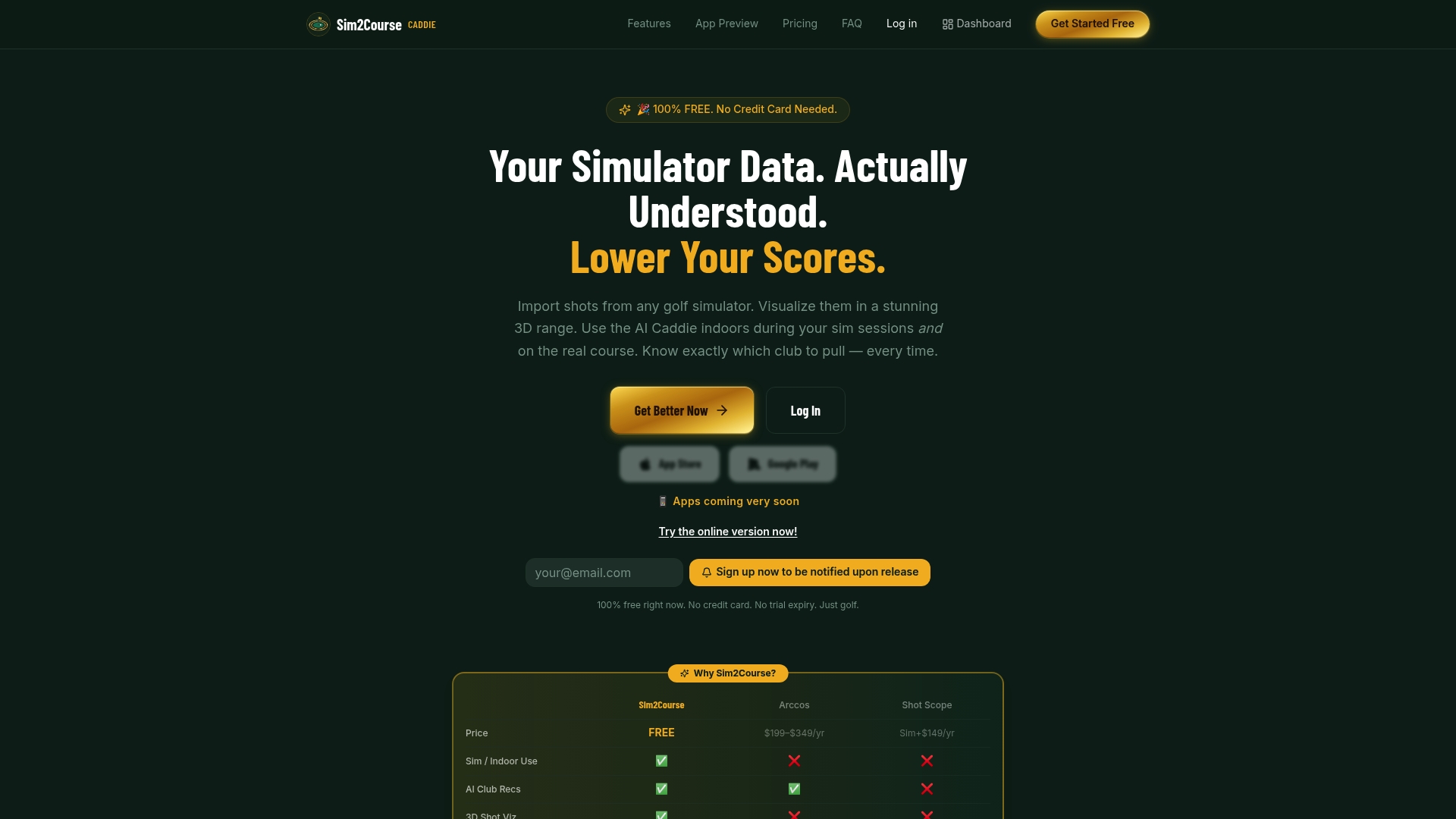
Sim2coursecaddie imports shot data from any golf simulator and provides structured raw data exports in formats that work directly with pandas, SQL, and visualization frameworks. The app also delivers AI-driven club recommendations based on your actual shot history, so your dashboard questions are grounded in real performance gaps. Golfers who want deeper data access and additional analytics features can explore the upgrade options to expand what their dashboard can show.
FAQ
What data does a golf sim performance dashboard track?
A golf sim performance dashboard tracks metrics like carry distance, lateral dispersion, ball speed, launch angle, and club efficiency. Statistical summaries including mean, standard deviation, and 90th percentile give the clearest picture of consistency and ceiling performance.
What is the best tool for processing home sim data?
Python with pandas is the most widely used tool for processing golf simulator shot logs. SQL is equally effective for golfers who prefer a database-first workflow, especially when managing large multi-session datasets.
How many metrics should my first dashboard include?
Start with no more than five metrics tied to a specific training goal. Dashboards focused on a few key questions produce clearer improvement signals than those displaying all available data at once.
How often should I update my golf performance dashboard?
Update your dashboard after every session by running a processing script that appends new shot data and recalculates rolling averages. Nightly automated scripts prevent data backlogs and keep your trend lines accurate.
Can Sim2coursecaddie data feed directly into a custom dashboard?
Yes. Sim2coursecaddie exports structured shot data in formats compatible with pandas and SQL. That data includes per-shot club metrics and session summaries ready for aggregation and visualization.